Skeumorphism vs flat design – what iOS 7 will bring?
When the premiere of the iPhone with the new Apple OS (iOS) system took place in 2007. Similar emotions are evoked by every premiere of the new version of this system, dividing those interested in the subject into advocates and opponents of subsequent changes.
What iOS 7 will bring? Everyone is waiting for changes in the age-old iOS interface. Short characteristics of the current situation and the path he has in this context below.
The main and official (inscribed in iOS Human Interface Guidelines) feature of the graphic interface of the iOS is skeumorphism. The skeumorphic interface launched with the premiere of the iPhone in 2007 has become the main distinguishing feature of the Apple mobile devices. Skeumorphism is “ reconstruction of the properties, shape, texture, color or function of the original object in the substitute material ”. In practice, it means that iOS applications should look like real items and imitate their real features. Thus, we have a compass that looks like a real, notebook with cards and font reminiscent of a handwritten letter, or even a voice recorder with a faithfully reproduced stylish microphone.
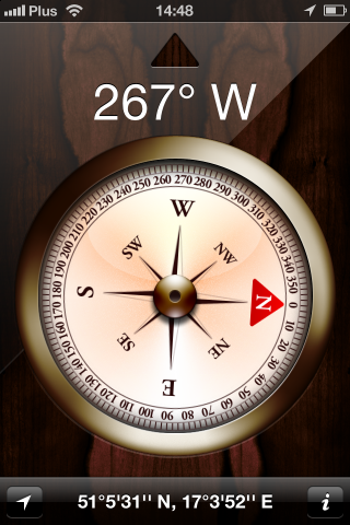

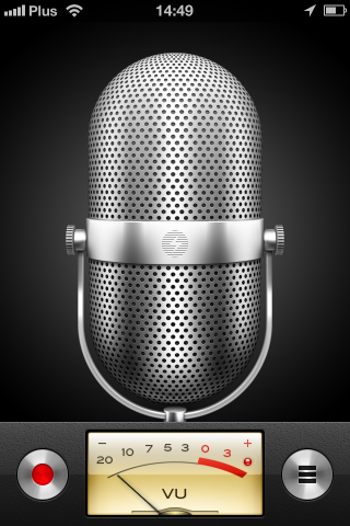 Skeumorphism was to eliminate the barriers of learning about the new interface and learning its operation by users. He gained many supporters but after 7 years seems to go where the market is heading – towards simplification. Increasingly, applications breaking skeumorphic guidelines for Apple and they are gaining crowds of supporters appear in the App Store, which translates into a high number of downloads.
An interesting translation are two very characteristic weather applications of the same Robocat publisher: Thermo and Haze. They both have the same function – they give the ambient temperature, but the first is based on 100 percent about iOS, the second completely contradicts it. The first celebrated triumphs shortly after her release last year, the second appeared later and with its simplicity she also won a number of fans:
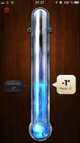
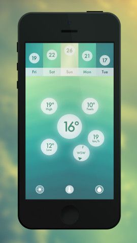
Time has shown that users want to pay for good appearance and high quality. IOS applications have always been distinguished by refined graphic details, high quality graphics, as well as a coherent interface. Today, this style is no longer new and the creators of the application are increasingly leaving it.
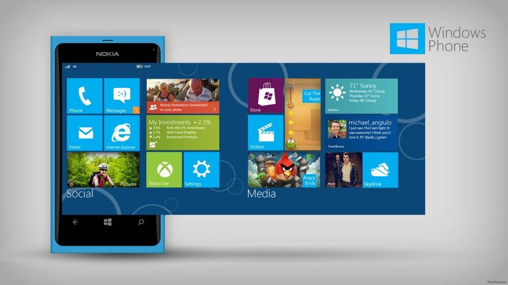
The answer to skeumorphic graphics iOS ’ A is flat design promoted by Google and Microsoft. The development of the mobile market and the number of devices that have been on sale since 2007 meant that Android and Windows Phone presented different design guidelines than Apple. Flat Design is characterized by simplicity, minimalism, beautiful and pure typography, large photos. In the opposition to iOS Google and Microsoft go according to the content of content first, where the graphics go to the background, and above all, it is easy and uninterrupted with additional decorations access to content with additional decorations.
Windows Phone – Flat Design
Android – Flat Design (Google+)

Skeumorphism today seems a bit outdated. Works in applications for a younger recipient, but when we want the usable application to make the task easier as possible, the extensive graphics become less important, and the time devoted to its preparation inadequate to the role that the application is to fulfill the application.
The question arises in which direction iOS 7 will go? How far will they be and whether there will be changes in the guidelines at all? iOS will probably not leave its users, accustomed to characteristic solutions for years, but movement towards modernity on the wave of Android’s success seems to be inevitable. What Apple will show, we will see in June, meanwhile we hold our breath and follow the industry inquiries.
At the top of the photo of Jonathan Ive – the main designer at Apple
I especially thank Dawid Frątczak for inspiration and substantive verification.
