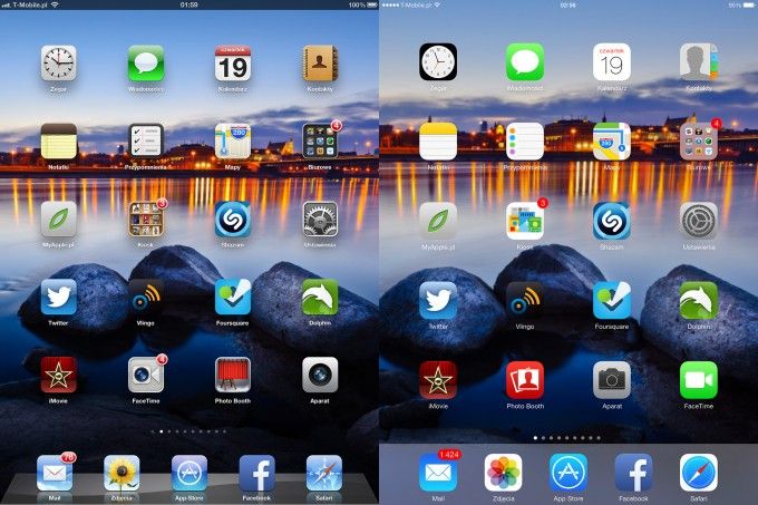
Change is good – a revolution in the iOS 7 operating system on iPad
From now on – it is not the same iOS as it used to be. iOS 7 – this is a completely new phenomenon in the mobile world of operating systems. Of course, as it usually happens, there are those who like it, and there are those who complain about the flattening of the design and a new look. This situation occurs with the appearance of Facebook.
Yes, all bullshit, metal imitations, light reflections, etc. have disappeared, but the size, proportions and, above all, the appearance of icons and other details have changed. They are now more clear, cleaner, transparent.
There have been many semi -transparent elements, in the background we see a fucked screen wallpaper. The main screen changes the color by matching the wallpaper, the same folders. The icons give the impression of hanging over the wallpaper, despite the fact that the effects of the convexity were abandoned.

New animations have appeared: opening and closing programs, groups of folders have new functionality – recession. You can go into a group, and then into a deeper group created in it and in the next and another. In addition, the wallpaper moves – depending on how we move your hand by holding the iPad – you can say that it swims. Spotlight search engine was also transferred to the main screen.
The Notification Center was also changed. It is still enough to move your finger down to open it, but there is a lot more information than before. We have a calendar, meetings, weather, stock exchange shares. The second tab is notifications – as standard as in previous versions.
Icons in iOS7 that have changed
A novelty, however, is the control center extended from the bottom of the screen. Many people expected this, because hence we have access to aircraft, Wi-Fi, Bluetooth mode, “do not disturb” mode, screen rotation, screen backlight, music playback or movies, sound adjustment, AirPlay services and Airdrop. The latter is new – it is used to send files between synchronized devices. We also have a flashlight, clock, calculator and camera.
The next news is the automatic UPPek update in the App Store. You no longer have to remember about manual update, which will certainly be very handy for many people.
After the update, changes among the programs offered to the Apple operating system became noticeable. The largest manufacturers of popular applications have replaced their flagship programs, and also changed the icons more adapting them to the appearance of the new iOS.
Another nice ficze is the tab „ Near me ”. Automatically searches for programs related to the place where we are – e.g. Applications of cinemas, cafes or city offices.
At the time we reach the camera application, new possibilities in the quality of photography are opening up for us. We have here a camera imposing filters in real time taking a photo, which we already know from Android. We also have the ability to take photos in a square, which has a long time Instagram, but we also have the option of taking serial photos – just hold the shutter icon longer, and the camera will start taking photos one by one by one after the other.
Photos and video gallery applications have been changed. Photos are automatically divided into smaller collections – the system segregates them in terms of date and places where they were made. Also in the editing of photos we have available photo-filters.
Safari’s browser interface has also been changed. We have white stripes instead of metal, a text field common to the address and search, three -dimensional card preview, as well as a preview of open cards on other devices, which we can see thanks to synchronization with iCloud.
In addition to the appearance in the Siri assistant, speech recognition has been improved, as well as control of other functions. The guy’s function is extended to include voice calls, you don’t have to turn on the fork when it won’t be needed.
Work on iPad with iOS 7 is pleasant and very intuitive. In my assessment of the new operating system, I am favorable to all changes offered by Apple. This is a great step forward, design chasing the latest trends among graphics on mobile devices, and ideale catching him with the equipment that lies under the hood of our iPads and iPhone ’ this is the key to success. I am convinced that after the wave of criticism with which this system is encountered, graphic designers and designers will start imitating the solutions used in iPads and iPhones. Anyway, this can be seen on the Behance portal.Net, on which many designers offer their own interpretations of the new iOS, icons and applications that seem very consistent with the new direction specified by Jonathan Ive.
Author
 Łukasz Grondecki. Owner of Page Interactive, Creative Art Director. He designs innovative solutions in the design of mobile applications and websites. He has been designing for over 11 years, he cooperated with the largest advertising agencies in Warsaw. Speaker at the Warsaw Interactive Tools 2013 conference. As an expert in the field of interactive marketing, he often speaks for traditional media M.In Panoramas, Brief, Telix.pl. He also deals with photographing and creating short advertising films.
